
Table of Contents:
- Learn About Color Mixing
- Color Terminology You Should Know
- Primary, Secondary, and Tertiary Colors
- Using the Color Wheel
- What Happens When You Mix Complementary Colors?
- Creating Different Vales
- How Paint Swatches Help
- Tips on Color Mixing
Learn About Color Mixing
It’s hard to believe that with just three colors—red, blue, yellow—you can mix every color imaginable. But, if you mix them in the wrong combination, you could end up with a color you don’t want. Understanding color mixing is known as color theory and is easy to learn once you know a few basics. This article will give you those plus some tips to make it easier to get the color you want every time.
Color Terminology You Should Know
When talking about color, there are specific words that define all the subtleties of color and give a clearer picture of its essence. As a beginner, you may have already gotten confused reading art books or blogs that use this terminology. These terms are important to know as a painter and once you learn them, you’ll understand why. Here is a glossary of the terminology you should know.
- Hue - While the word color is a universal term, the word hue refers to the actual color that distinguishes it from other colors—red, blue, purple, green, etc.
- Value - Value refers to the relative degree of the lightness or darkness of a color. For example, as you add white to a color, it becomes a lighter value of that color. Adding black gives the color a darker value.
- Saturation - Saturation refers to the chromatic intensity of a color. Highly saturated colors have absorbed all the light waves of that color possible.
- Shade - This is the term for the slight differences in a specific color. Blue mixed with a little green can be said to be a “shade of blue.”
- Tint - This term can be used interchangeably with shade.
- Tone - Tone refers to an aspect of color once gray (black+white) have been added.
- Hight-Key - This term is used to describe the range of shades of a color that go from its mid-tone to white.
- Low-Key - This term is used to describe the shades of color that go from its mid-tone to black.
- Pigment - Pigments are the compounds or substances in which paints are made and which give them their color.
Primary, Secondary, and Tertiary Colors
The best way to start is to understand basic color mixing. All colors can be mixed from what is known as the primary colors—red, blue, and yellow. These three colors are called primary colors because they cannot be created by mixing two or more colors together. They’re the basis for all other colors, with the exception of white.
If you mix red and blue, you get purple or violet. When you mix blue and yellow, you get green. Mixing red and yellow gives you orange. Violet, green, and orange are known as secondary colors.
What happens when you mix a primary color with a secondary color? You get what is known as a tertiary color. These are red-violet, blue-violet, blue-green, yellow-green, yellow-orange, red-orange.
Using the Color Wheel
It may sound confusing at first, but there’s a tool you can use to see at a glance what to mix with what to get the color you desire. It’s called the color wheel. The most basic color wheel has the primary, secondary, and tertiary colors side-by-side for easy reference. There are other wheels that have these colors along the edge and an inner wheel that allows you to rotate the colors to see what other shades and color schemes can be created.
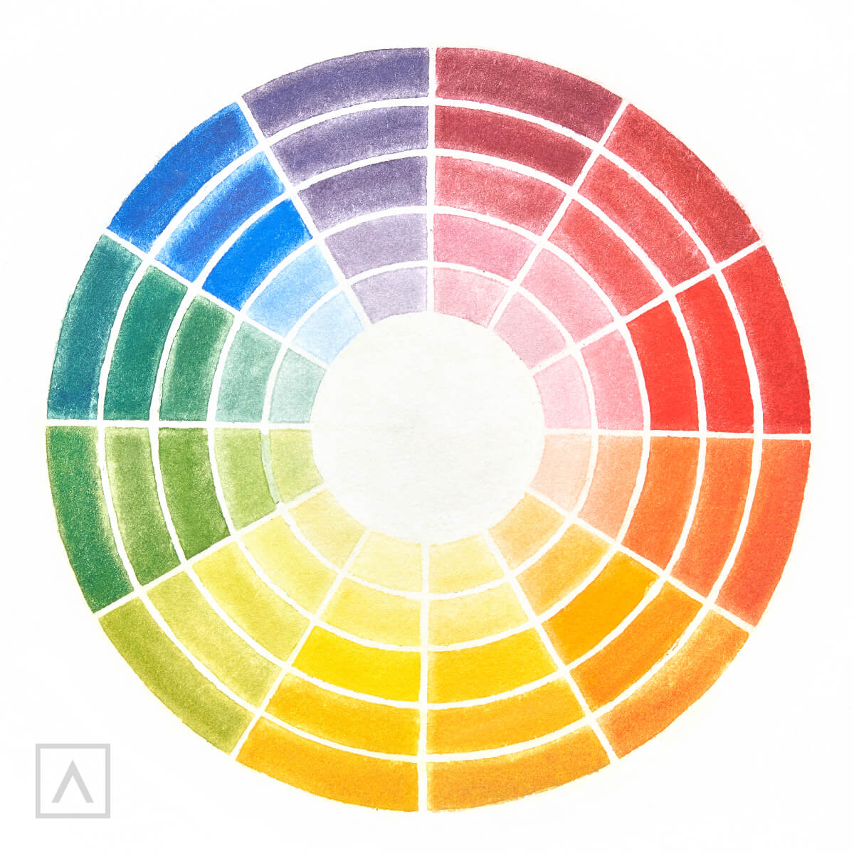
Color wheels are also important for creating color schemes. Color schemes set the mood of a piece and are integral to helping the artist convey a scene or subject in a particular way. When an artist uses three colors that are next to each other on the color wheel, such as red, red-orange, and orange, they are using an analogous color scheme.
When you mix colors that sit exactly opposite from each other on the color wheel, you get a complementary color scheme. Examples of complementary colors are red and green, blue and orange, yellow and purple, yellow-green and red-violet, red-orange and blue-green. If you use one color mixed with its complement plus the tertiary colors on either side of it, you get what is called a split-complementary color scheme.
Triadic color schemes use three colors that are evenly spaced on the color wheel. An example of this would be yellow-orange, blue-green, red-violet or blue-violet, yellow, green, and red-orange, etc.
Color schemes can create a harmonious composition or one full of energy. Knowing how to use colors to create the effect you want is as important as using them for getting accurate hues of your subject.
What Happens When You Mix Complementary Colors?
You’ve learned what happens when you mix primary colors together, but what happens when complementary colors are combined? If you were to mix together red, blue and yellow, your primary colors, you would get a dark, muddy hue. It’s logical to assume you would get the same thing when mixing the complementary colors, so why would you do it? Artists combine complementary colors when they want to make different variations of neutrals, especially blacks. For instance, mixing red and green can create a black with warm undertones that will look different from a black created by combining blue and orange or yellow and purple. By adding a little white to these, you can also get a wide range of grays.
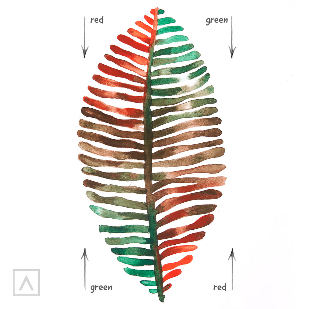
As you progress in your artistic endeavors you will begin to see all the subtleties in the colors of your subjects. What might look like pure black at first glance, on further examination actually has some shades of blue or purple. The more you develop your “artist eye” the more variations in a color you’ll begin to see.
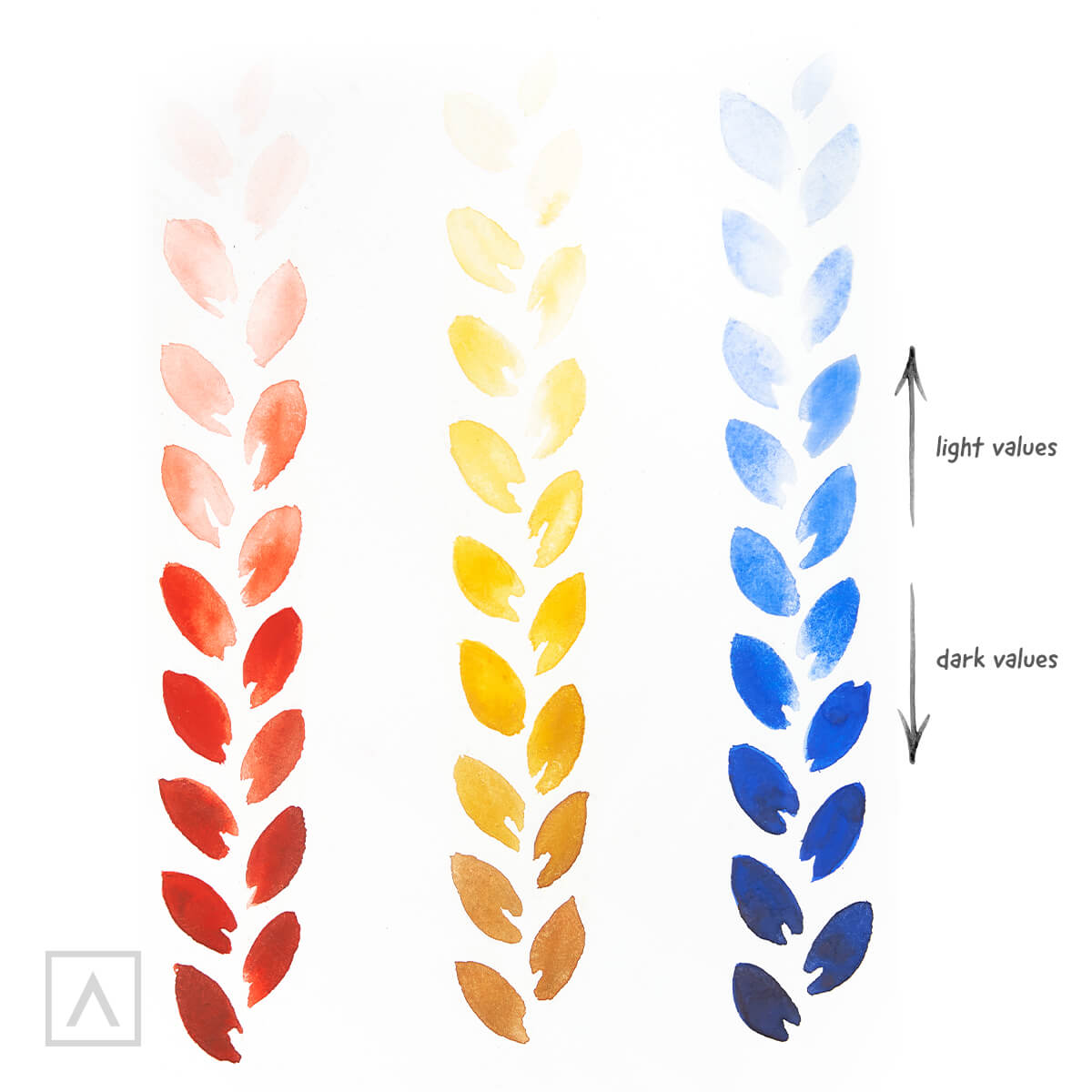
Creating Different Values
One way to give your subject depth and volume is to add contrast through shading. This involves placing a light source on one side of your subject and painting the resulting shadows. Since your subject and its shadows are not one single hue, but a variation in lightness and darkness of that hue, it’s crucial you know how to mix different values of these colors.
A handy way to get the hang of getting values is to create a value scale of the colors you’re using. To do this, simply start with your color and add a tiny bit of white. Drag some of that color down and add a tiny bit of white to it. Continue dragging some of each new color and adding white until you have a “ladder” that goes from your original color to pure white. These are all the light values of your color. Conversely, do the same thing only this time adding tiny amounts of black. This ladder shows all the dark values of your color.
HINT: If you're working with watercolors and you want to make your color lighter, you should add more water instead of adding white to your color. The more water you use, the lighter the value of your color will be. To create a darker value, use less water. If you want your colors to be even darker, you can add some black
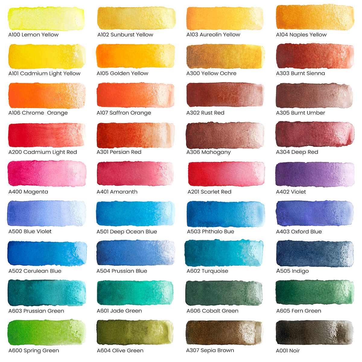
How Paint Swatches Can Help
A fun and easy way to discover all the colors you can get is to make paint swatches or a color mixing chart. Draw a grid and start applying different mixtures of paints to each block. You can practice by seeing how many different greens, purples, or oranges you can make. Notate which colors you mixed for each swatch and you’ll have an instant guide you can refer to as you paint.
Here are the Arteza Watercolor Half-pans swatches that I use when I start painting with this vibrant set
Tips on Color Mixing
- Add dark colors to light colors. If you’re trying to get a lighter shade of a color, it’s best to add it to white or another lighter color than the other way around, since it’s more difficult to lighten a color than to darken it. For example, it’s easier to make pink by adding the red to white than keep adding more and more white to lighten the red. You’ll also use less paint by doing it this way.
- Use neutrals to make more vivid colors stand out. By placing gray or brown next to bright red, for instance, the red will appear more brilliant than if it was surrounded by another bright color.
- Don’t use black to darken a color. Although you may think it makes sense to just add some black when you want to darken a color, black can actually result in flattening or muddying the color. Instead, try using a dark cool color such as ultramarine blue or a warm neutral such as burnt umber.
- Shelve the black altogether. To create blacks that retain their vibrancy, try mixing complementary colors, such as red and green, together instead of using pure black from the tube.
- Cool off or warm up your colors. You can create a range of cool colors by adding blue while adding red or yellow will add warm undertones.
- Want to know what colors make brown? It's easy, just mix together all the primary colors!
- Practice color mixing without paint. The website, Try Colors, is a great resource that will allow you to combine tons of colors without opening a tube of paint.
- Mix colors lighter than you want them to dry. Typically, the paint dries to a darker shade than what’s been initially applied, so mix colors a few shades lighter to ensure you’ll get the correct shades.
- Save your leftover paint. It’s possible to save the leftover paint on your palette once you’re finished painting. Simply scrape the paint from the palette into jars that have a secure top or you can purchase special containers for this at the art supply store.
- Don’t overmix. Be careful not to add too many colors when mixing or you’ll end up with a muddy mess.
The more you paint the easier color mixing will be. And, like many artists, you’ll find that you gravitate to certain combinations more than others. This is just one way you’ll develop your unique artistic voice. We hope this article has helped you understand color theory. Please let us know your thoughts in the comments section below. Most of all, have fun and happy painting!


5 comments
What are considered the primary colors on the watercolor tubes? (I have the 24 tube set)
Hi Laura! Great question. We believe the color names that best fit the primary colors in the gouache set of 60 may include A106 Scarlet Red, A121 Mid Yellow, and A110 Ultramarine Blue.
I have the same question that Kimberly had about the Brush Pens, but in regards to your gouache set. I have the 60 set and I’m planning on filling some pans (14) with a few colors to make a smaller travel set.
If I had to assume, a primary red could be A115 rose, yellow might be A102 lemon yellow, and blue would be A110 ultramarine blue.
Which would you say are the “three primaries” from which all other colors can be blended?
Thanks
Hey Kimberley! We believe these are the color names that best fit the hues you listed:
Red: Red A101
Red-orange: Cadmium Orange A140
Orange: Orange A112
Yellow-Orange: Sunset Yellow A156
Yellow: Lemon Yellow A105
Yellow-Green: Acid Green A152
Green: Green A179
Blue-Green: Turquoise A171
Blue: Caroline Blue A166
Blue-Violet: Dark Blue A119
Violet: Violet A109
Red-Violet: Mulberry Pink A110
Which Real Brush Pens are the equivalent of the main colors on a color wheel? Some I assume. I know warm and cool primaries figure in, too, so which of your color names most closely represent these hues?
Red A101
Red-orange
Orange A112
Yellow-Orange
Yellow (lemon yellow A105?)
Yellow-Green
Green A179
Blue-Green
Blue (Cyanine A159?)
Blue-Violet
Violet A109
Red-Violet