
Table of Contents:
- Fundamentals of Painting Landscapes Using Watercolors
- Making Your Initial Sketch
- Creating a Color Palette
- Understanding Aerial Perspective
- Why Is Tone Important?
- Adding Details
- The Principle of General to Specific
- Creating Effects
Fundamentals of Painting Landscapes Using Watercolors
Painting landscapes with watercolors can be very satisfying and challenging at the same time. If you’re an aspiring watercolor artist, there are some basic principles you can learn that will help you create better landscapes using watercolors. I’ve written this article especially for you. Here you’ll learn some universal rules used by watercolor painters everywhere.
As an experienced watercolor painter, I recommend using Arteza’s Watercolor Premium Artist Pain Half Pans. This set is a convenient way to use watercolor paint since it provides a variety of brilliant colors in a handy case that’s ready to use whether your painting inside or outdoors. These pan paints can be rewetted and used over and over. Whenever you use watercolor paints, whether you’re using them from pans or tubes, it’s important to use the right paper. Watercolor paper is thicker than other papers and made to be used with wet media. It doesn’t buckle or warp when it gets wet as lighter-weight papers are prone to do. I like using a watercolor pad since it’s portable and I’m able to keep my work protected.
Making Your Initial Sketch
Unlike painting with opaque paints, such as oil and acrylic, you’ll want to make your initial sketch using a very light line. To do this I recommend using an HB or harder pencil. This will ensure that your lines will not be seen through the paint.
To practice the following techniques you can either start with a photo as a reference or go outdoors and sketch from life. Either way, what you’ll learn will apply to both. When you begin sketching your scene, there’s no need to draw everything in detail. It’s only necessary to create a general composition to make sure that the size of the objects is not too large or too small for the size of your paper. To be sure that everything you plan to draw will fit into your work as well as maintain the proper proportions, continually compare the sizes of the objects relative to each other. Over time, you will intuitively feel the composition. Then you can skip the sketching stage and start working directly with the watercolors.
Creating a Color Palette
Creating a color palette will help you paint with confidence. Here is an example of a color swatch chart I made using Arteza’s Watercolor Premium Artist Paint Half Pans - Set of 36.
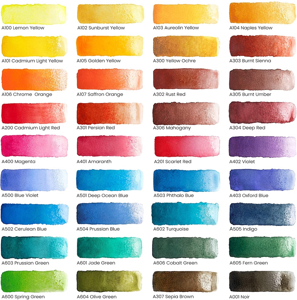
Swatches are easy to make and can become a handy guide when you’re trying to decide which colors to use. They give you an idea of how the paint will look without much water as well as thinned out. Watercolors are tricky in that they cannot be corrected once placed on the paper so it’s important to analyze and understand how the color, brushstrokes and tones will look before putting them on paper.
Making swatches also allows you to create a specific palette of the colors you will use. When faced with lots of colors, it’s nice to already have the ones you will use chosen and ready to go.
Understanding Aerial Perspective
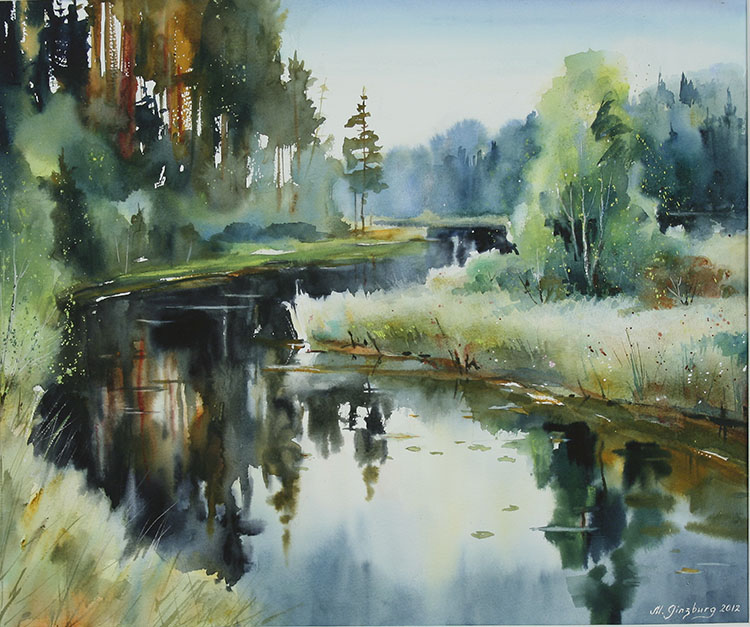
One of the most fundamental techniques in landscape painting is the use of aerial perspective. By using this method, your landscapes will look realistic and have the feeling of depth that’s so important. To understand the rule of aerial perspective you should know that the air is inherently cool. Therefore, the more air there is between you and the object you’re painting, the colder the object will be. This means that all the elements of your painting that are far into the distance, the cooler the colors you paint them should be. The elements that are closer to you will be in warmer colors.
For example, here is the work of the Swedish watercolorist Maria Ginzburg. Notice how cool blue the trees at the horizon are and how the grass that’s closest to the viewer is in warm shades of yellows and greens.
Why Is Tone Important?
The tone or value of your colors is also important in giving your landscapes the feeling of distance. This principle is based on the fact that the atmosphere is made of microscopic particles that affect how we see things that are far away or near to us. Things in the distance are clouded with these particles so they are usually a lighter color, while things that are close to us are more in focus so we are able to see their color easier; therefore, their colors are darker. The further an object is the lighter its tone will be. Using highly thinned paint for the background and more saturated colors in the foreground will help you achieve this.
For example, here is the work of the wonderful Veronica Kalacheva. This principle can be seen really well in her works.
View this post on Instagram
Adding Details
When you want to look at something in detail, you get closer to it. That’s why the objects in the foreground of your painting should always have the most details. Since the farther you look into the distance, the fewer details you see, you will paint less detail on the elements in the background of your painting.
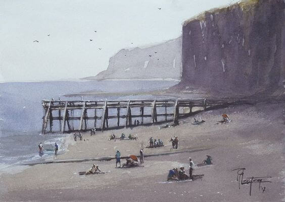
Here is the work of French watercolorist Tyl Destoop which is another good example of this principle.
The Principle of General to Specific
When working with watercolor, keep in mind the principle of working from general to specific. In the early stages, it is necessary to ignore the details and think in large forms. Try and just concentrate on the silhouette of your objects. Ask yourself questions like, “What shape will the sky be? What is the silhouette of that tree? What direction is the stream going?” Before painting these large areas, decide in advance where the highlights will be. Next, fill in these large objects with a large brush, leaving the highlighted areas untouched. When the painting is complete, these highlights will have strong contrast and look really impressive!
A watercolor painting should be done from light to dark because you can always darken your shades but you cannot lighten them. To darken an area, use multiple thin layers of paint (this is called glazing) to darken your colors to get just the right hue you’re looking for.
Now that you have decided on the shape of the objects, the main colors have been added, and you’re satisfied with it, you can proceed to add the specific details where necessary. These are usually on the main objects in the foreground. This will require a medium-sized brush. As your details become smaller, switch to a thin, liner brush.
Many successful artists work according to the principle from general to specific. Take a look at the sequence of work of Tyl Destoop, whom we talked about earlier.
Creating Effects
By adjusting your edges, you can make dramatic effects. By using less water and more paint or painting on a dry surface, you can create crisp, clear edges. To create softer edges, thin the paint with water or paint on a wet surface. As the paint dissolves into the water it spreads and disappears for a softer, more atmospheric effect. Сorneliu Dragan Targoviste masterfully does this in his works. Notice how the untouched paper contrasts against the paint.
PEISAJ DE IARNA! Pictura in acuarelă 27x37 Poate ne mai răcorim putin astazi, dragi prieteni! Se anunță o zi fierbinte!
Corneliu Dragan-Targoviste
With these few basic, yet important principles, you can easily create a simple and beautiful landscape. As you become experienced with this medium, you’ll discover more and more techniques that will make your work uniquely your own. It just takes experimenting and practice! I know you’ll soon find out that painting with watercolors is easier than you thought and you’ll want to keep going! Let me know your thoughts on watercolor painting in the comments section below.


2 comments
Any time, Lorna!
Very helpful tips. Thank you