Table of Contents:
- Make Colored Pencils More Realistic
- Examine the Tone and Volume
- Draw a Volumetric Apple
- Recommendations
Make Colored Pencils More Realistic
Being able to draw objects and people so that they look realistic is a great way to impress others and show off your observational skills. Many artists strive for realism in all of their creations. The ability to paint realistically is some basic knowledge that all artists must take the time to learn. Of course, once you understand the basics you can move on to different styles, but learning realism will help you understand your creations better as you change your style.
Self-taught artists are often looking for the secret to conveying volume as they would observe in the real world. They’ll often redraw one photograph after another, trying to draw all the details and depict every line visible to the eye. The results still often look like a flat photo, although sometimes it will look like the original subject.
The secret to drawing volume is to capture the subtleties that you’ll notice when you visually analyze an object. You’ll want to avoid creating fake or forced volume by darkening the edges of an object to feign the appearance of shading. Of course, it will take many hours of pencil-drawing lessons and practice to master all of the shading techniques. However, we will try our best to explain the basic secrets of drawing an object to look realistic. We’ll be using the example of drawing an apple using colored pencils.
Before drawing any realistic object, we must carefully analyze it:
- What is the tone of your object: light or dark?
- What simple geometric shapes make up your subject?
- Where does the light come from?
- Where will the highlights and glares appear?
- Where does the shadow appear and where does it fall?
- Where and what reflections from the external environment appear?
Examine the Tone and Volume
Let's observe our apple together! We have noticed that the apple is green, medium tone, not very light, but also not dark. Let’s carefully examine the tone because this is where it all starts.
Tone (or shade) refers to the degree of illumination or darkness in different areas of the drawing. To achieve realism in your artwork, you need to correctly convey the distribution of light on the surface of the depicted object. The most illuminated areas will be the lightest; these are called the highlights. These are the lightest spots on the surface of the object. The farthest parts of the object from the light source will be the darkest and will be the shadows.
To add volume to your image, you need to be able to make transitions between tones. Try to practice and make a gradual transition from dark to light. This will help you understand how to make tonal transitions smoothly and how to adjust the pressure on the pencil to get both light and dark areas.
Gradient in One Color (Picture 1)
See how the texture of the paper becomes more noticeable when you apply light pressure on the pencil. This makes the transition from dark to light go more smoothly.

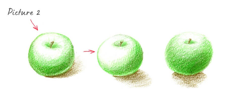
If you want to make the objects in your composition look three-dimensional, shade them in a way that makes it appear as if the light falls on them from only one side. This means that the main light source should be the brightest. Light is a very important point because it should reveal the shape and volume of objects. It is best to choose a light source coming from a top corner (usually on the left). This way the main shadows, highlights and, most importantly, reflections will be well-defined. The drawing will look more realistic where there's only one light source because the transitions between tones are more visible. The light should not be "blinding," it should not be in front of the artist or illuminate the object "head-on." Avoid positioning the light source in the "contour," or behind the object being drawn. This lighting either completely deprives the object of shadows and tones, or completely plunges it into darkness. In these cases, the volume of the object is very difficult to depict and basically not visible.
Variants of Incident Light on an Apple (Picture 2)
The paper is considered the lightest area, so the highlights can be left uncolored. Keep in mind, the farther the object is from the light source, the darker its tone.
Objects with volume on a plane cast a shadow in the direction opposite of the light source. If the light falls from the top left, then the shadow will be located on the bottom right. Shadows are less visible on dark surfaces than on lighter ones.
Before we start drawing our object, it’s important to represent it in its basic geometric form.
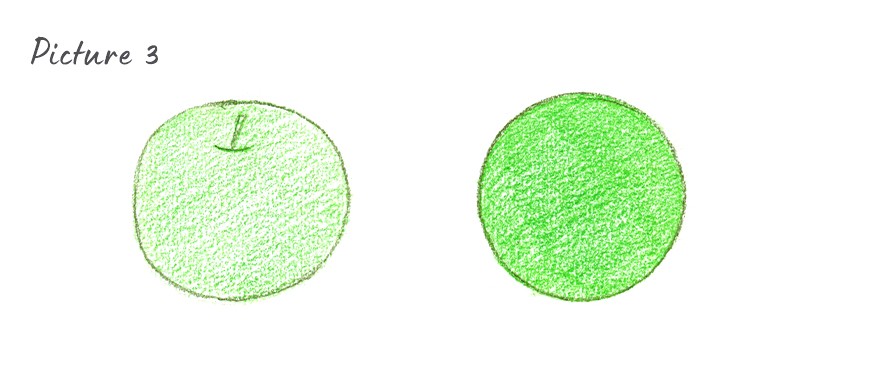
Learn to Color Neatly (Picture 3)
By understanding what simple shapes make up the basis of an object, we will be able to understand how to color our object and how light is distributed on it. In this post, we won’t be discussing how to turn flat geometric shapes into three-dimensional ones. If you are interested in this, leave a comment for us and we will definitely consider writing about it next time. We will now be taking a look at the forms that will help us draw a realistic apple, see how the light and tones fall and how the reflections are formed.
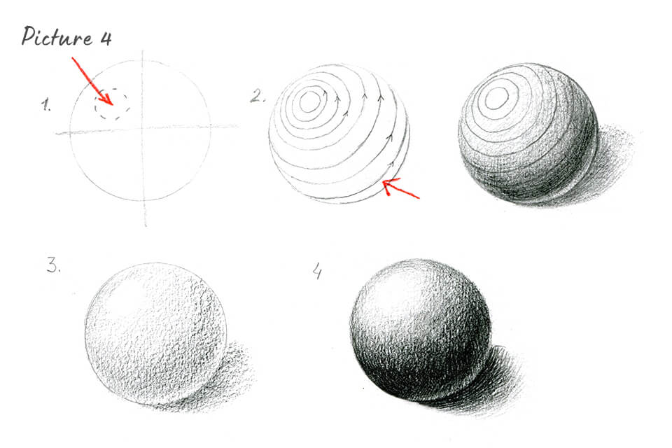
Stages of Drawing a Ball (Picture 4)
- Draw a circle. Divide it into four equal parts mentally. The lightest part, or highlight, will be in the center of the upper left part. You’ll want to make a mental picture of this; we’ve drawn them in order to help make it more clear.
- We’ve drawn construction lines in order to make it easier for you to imagine the shape of the ball. The lines emphasize the roundness of the surface, but also show how the color is applied. We will also add shading according to the shape of these lines. In your drawing, you won't draw these lines—just keep them in mind as you draw.
- Start adding tone. Do this with light movements. You can color with the side of the pencil, without pressing down too hard, in the shape of a circle. Draw a shadow coming from the ball.
- Apply strokes in layers to try and achieve a gradual transition of tones from light to dark (from highlight to shadow). You do not need to try to copy the shape of the balls using lines, the toning should be uniform and smooth. Reinforce the drop shadow with hatching. This adds realism and strengthens the illusion that the ball is on the table.
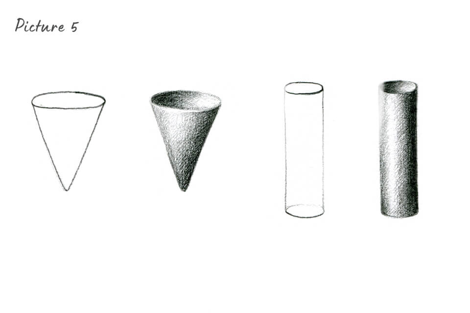
Schematically (Picture 5)
Let's also look at how shadows and light fall on a cone and a cylinder.
Now let's go back to our apple and draw it using colored pencils to give it a more realistic look! The apple resembles a sphere with a cone-shaped hollow where the stem is. You need to rely on the shading features of the ball, cone and cylinder, which we showed earlier, to draw the apple correctly.
Before you start working, prepare the pencil shades you’ll need. We used our Set of 120 Colored Pencils. We used the following shades:
- Cream A150
- Fluorescent Yellow A126
- Absinthe Green A099
- Matcha Green A006
- Moss Green A029
- Olive Green A155
For the stem and shade, we will use:
- Ginger A112
- Coyote Brown A111
Gradient of the colors I use in the apple (Picture 6)

The process of drawing a volumetric apple
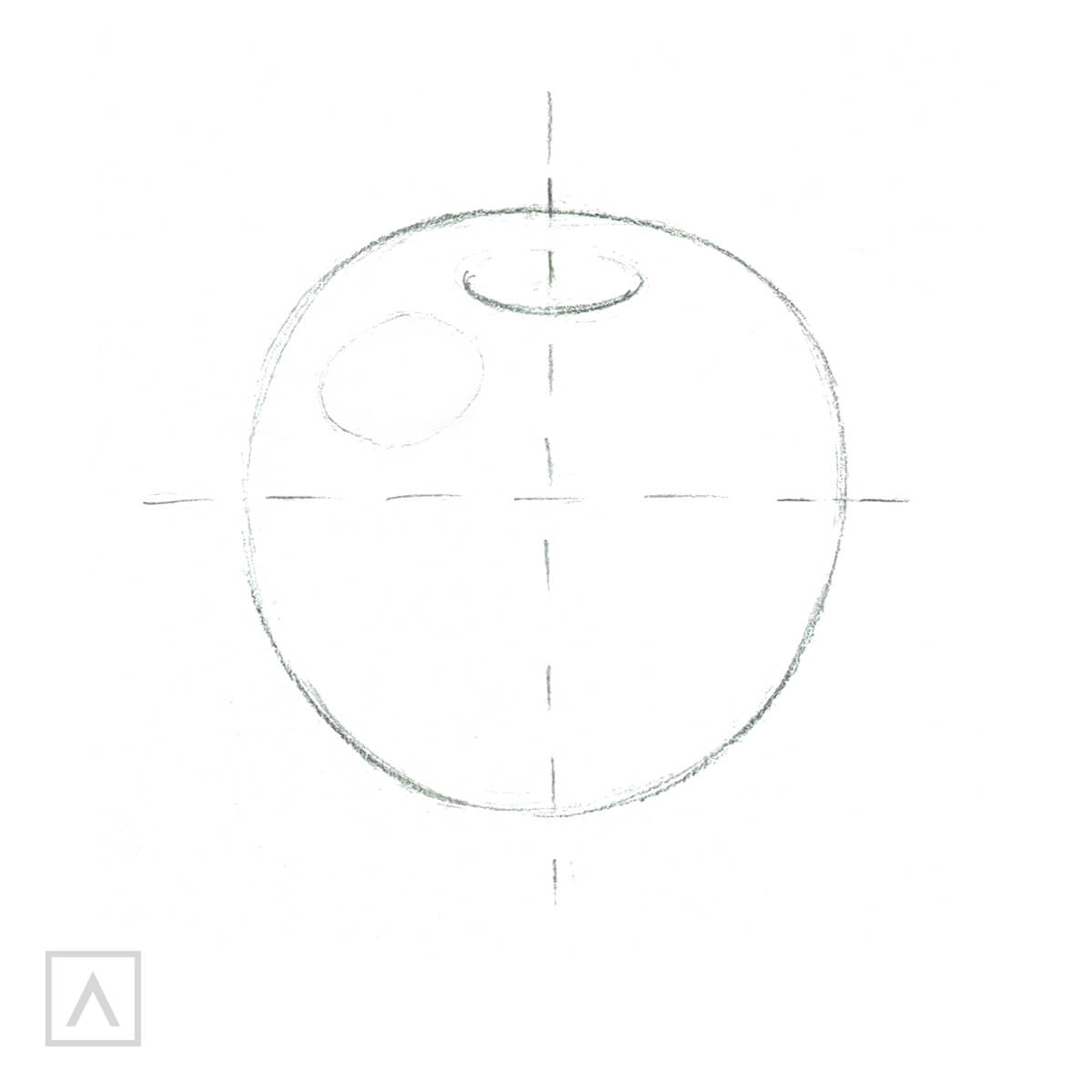
Step 1
The apple is positioned so that the light source is on the left of the apple. As you can see, the highlights and shadows are clearly visible on the surface. Use thin lines to sketch the contours of the object. A highlight will be in the upper left part.
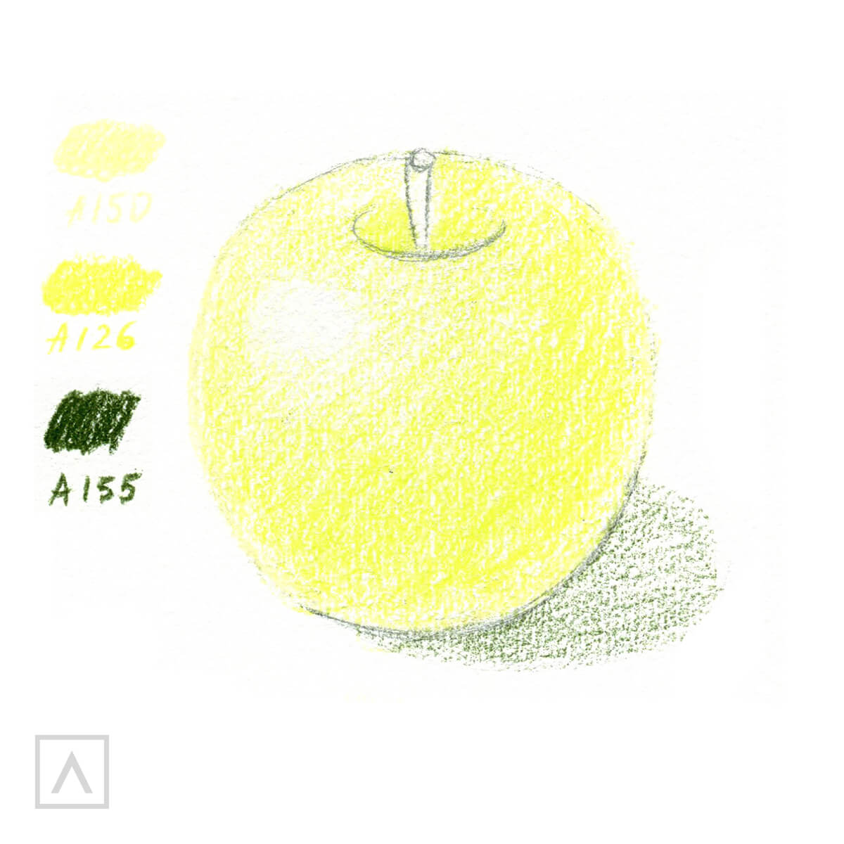
Step 2
Use A150 to color the apple with light hand movements and without pressing on the pencil. Make sure to leave an empty section for the highlight. Use A126 to create a gradual transition of tones from light to dark (from highlight to shadow). Use A155 to draw the apple's shadow.
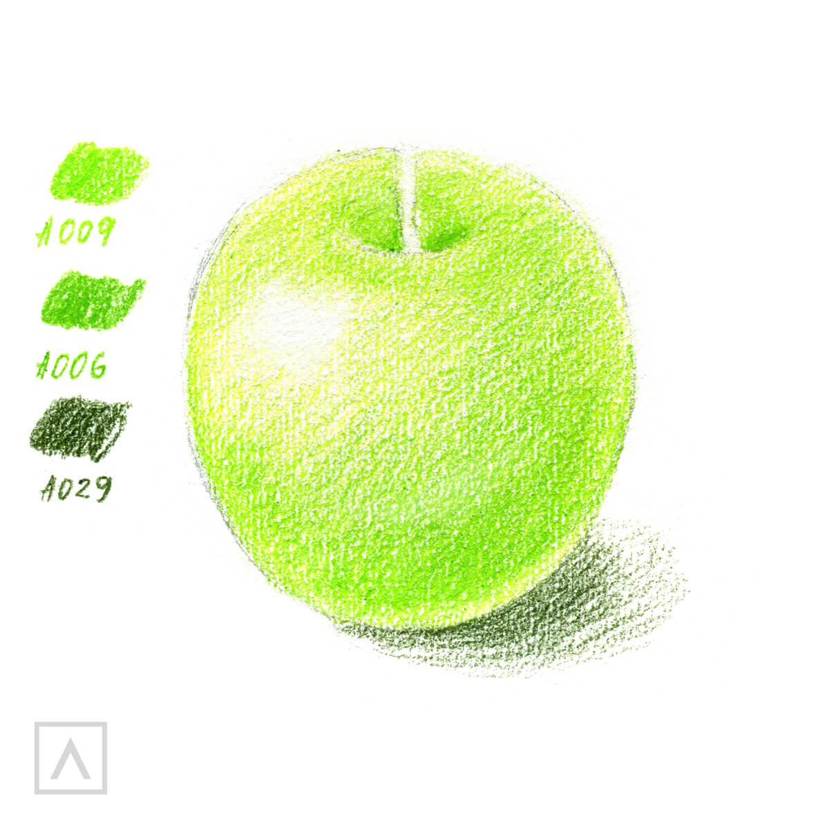
Step 3
The subsequent shades will be added in layers to make sure that the transitions between light and dark areas are smooth. Use A009 and A006 to color the area where the stem is. Reinforce the shadow using A029.
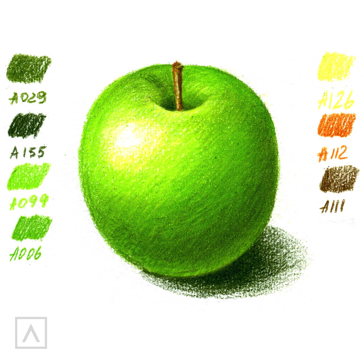
Step 4
Continue to achieve the desired saturation by adding all of the above colors and in the dark parts of the apple use A029 and A155. Draw a stem with A112 in the light part and A111 in the shadow. Make the shades of the apple more saturated by using a lighter touch at the end of each shade.
Recommendations
As you’re finishing up your drawing, you can blend the areas of the picture using A150. Blending allows you to make the colors more uniform and smooth. This is done slowly and gradually, without pressing hard on the pencil.
Now you know the basics of toning, the effect of light on simple geometric shapes and can create the impression of depth and volume in your drawings.
It’s important to take your time when you’re drawing objects from observation. You now know that you need to analyze the shape carefully and understand how the light hits the object. Once you’ve mastered the basics of shading, you can turn any flat object into a realistic, three-dimensional drawing.
We wish you the best and hope you keep practicing. Remember to draw from nature and carefully study the shapes. You’ll notice your work getting better and better every time you start drawing. Don't forget to check out our wide range of colored pencils!












5 comments
its very hard but i think i do it
Hey Cindy,
That’s definitely our goal! We’re here to provide the most helpful tips and tricks that are beneficial for everyone in all walks of their artistic journey!
I’ve only been drawing for about 1 1/2 yrs, but I thought it was in the wrong place. Guess I am learning after all! Lol!
Thanks for your input, Benny. :)
The final image of the apple is incorrect. With your light source on the left, the shadow from the stem would end up on the right not the left side of the apple.