home>Pastel Colors

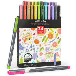
Set of 24
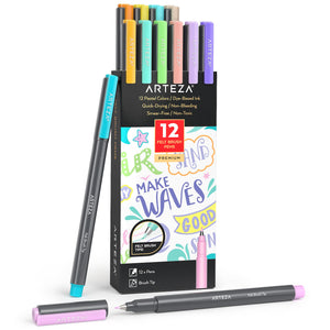
Set of 12

Set of 50 Sheets
Pastel Colors
Pastel colors are commonly described as soft and soothing, think baby blue, mauve, lavender, mint, and pink. The name is derived from the art media, pastels which come in the form of a short, chalky rod made from a powdered pigment and a binder. Like many things in life, the best way to learn pastels and learn to paint with pastel colors is by simply doing. If you’re interested in receiving a few tips on how to get started, please continue.
How do beginners use pastels? First, it’s important to make sure to keep your canvas vertical at all times because pastels create dust when in use, which can get in unintended areas if it is allowed to sit on your surface. We recommend using an easel to keep your colors where they belong. If you’re wondering which side of the pastel to use when making art, have no worries, as you can use either side of the pastel. While using the tip of the pastel creates more fine, sketch-like lines, using the wide edge of the pastel makes wide lines (as you may have guessed), and is great for covering large areas.
A favored characteristic of pastels is that they’re easily blendable. Once you’ve created your design and you’re ready to blend, simply go in with your finger, a cotton ball, or kneaded eraser and blend the colors together. With these tips, you’re set to embark on your pastel journey.
What is the best pastel color? Let’s begin by seeing what your favorite color is? Pastels allow you to embrace your creative freedom and decide what color is best for you because you can create and employ nearly any color you prefer. The range of pastel colors is vast, since they can be layered and blended together. However, there are definitely a few guidelines you should follow to keep your artwork aesthetically appealing; to better familiarize yourself refer to a color wheel.
What pastel colors go together? The best way to understand which pastel colors work together is to start by understanding the color wheel. We can call this guide our "pastel color palette." Colors that work well together, are known as “complementary colors,” and they can be found sitting opposite each other on the color wheel.
For example, yellow and purple complement each other, as can be seen on the color wheel. Mixing colors that don’t complement each other usually leads to a yucky brown color. So, keep that in mind on your next color-mixing journey. However, you don't need to feel restricted by the confines of the color wheel. It can be really fun to try creating art that utilizes both light pastel colors and darker, more solid pastel colors. For example, try mixing cute pastel colors (like a light pink or yellow) with some more aesthetic pastel colors, like a deep cobalt blue. Doing this will accentuate the lighter parts of your work and give it a bolder look. When creating your art, soft pastel colors don't only need to be paired with other soft pastel colors, unless that's the look you intend to display. Ideally, your art is unique to you!
Best of Arteza


- Choosing a selection results in a full page refresh.
- Opens in a new window.